Stranger Things Ambigram by Patrick Scullin.
Stranger Things Ambigram
As a child of the 80's I was caught up by the pop culture phenom, Stranger Things. Just like everyone else I binged watched every episode with delight and I can't wait for more. One day, while teaching a typography class, I realized that Stranger Things is screaming for an ambigram. This is especially true considering the "upside down" concept on the show.
Typography and ambigrams are a passion of mine and I created my own version of the Stranger Things logo in ambigram form for all to enjoy. What follows is a brief description of my process.
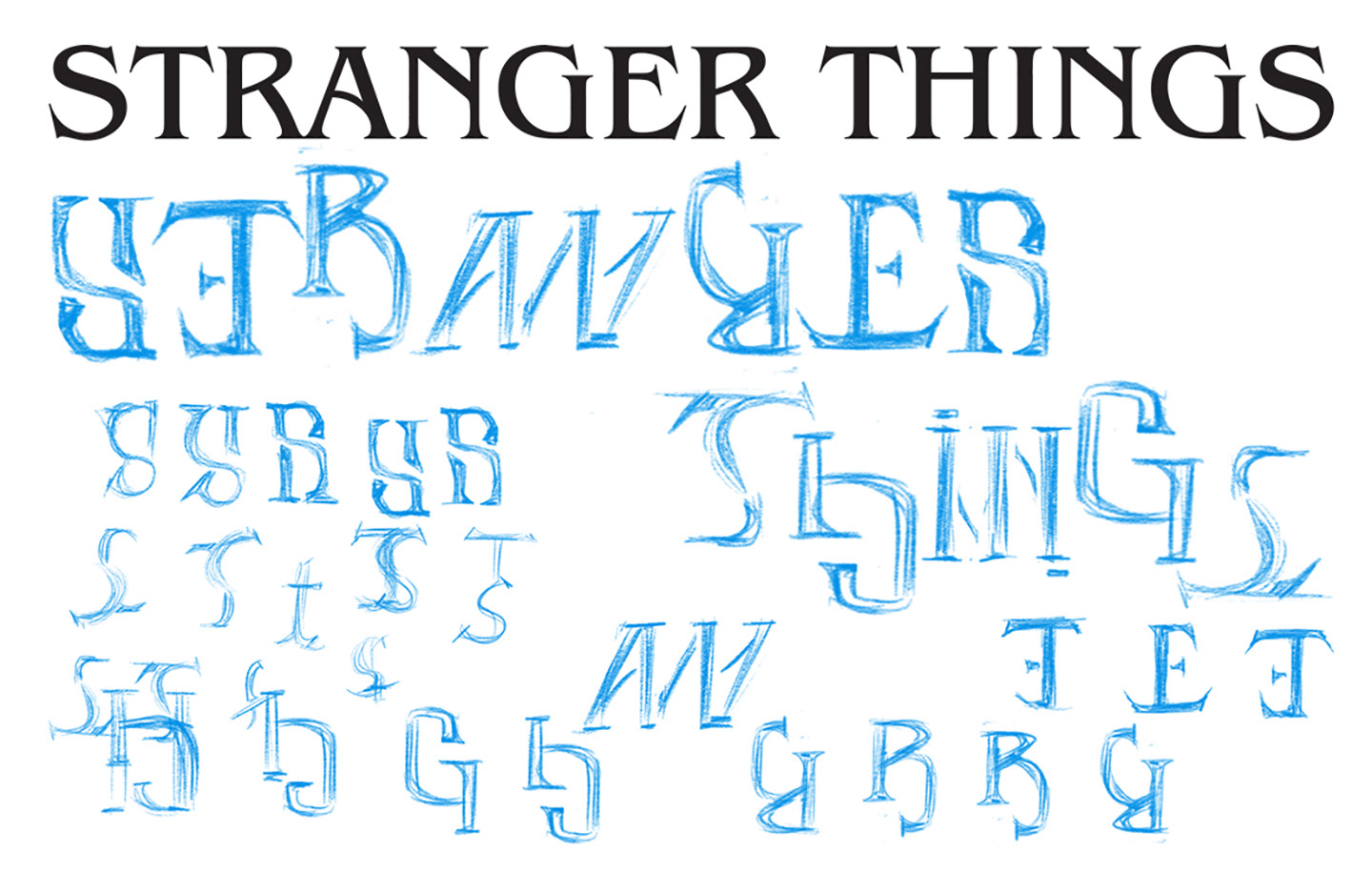
The best way to figure out an ambigram is to sketch it out first. The title font for Stranger Things is Benguiat and I knew my design needed look like it. My first attempt was to combine each word separately thereby making it possible to "stack" the two words like the original logo. After working it out on paper I realized that "stacking" would never work because when flipped upside down the text would read "things stranger" instead of "stranger things."
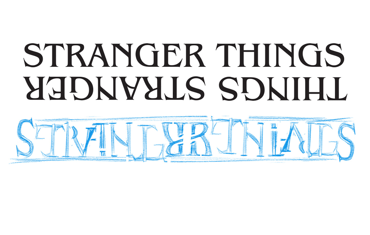
The next round of sketches involved testing out different letter combinations and looking for ways to accommodate the space between the two words. The most difficult part was figuring out how to show the gap between "stranger" and "things" on one side and hiding it when turned the upside down on the other. After a lot of sketching and refining the solution finally came. My favorite bit is the symmetrical pairing of the "e" and the "r" in the middle of the logo. I also love the way the "t-h-i" hide between the "t-r-a-n" when turned upside down.
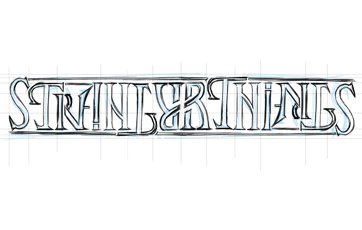
After my drawings were completed I used Photoshop to combine my sketches into the complete phrase. I then used the image file as a template in Illustrator to draw the letters as vector shapes using the pen tool.
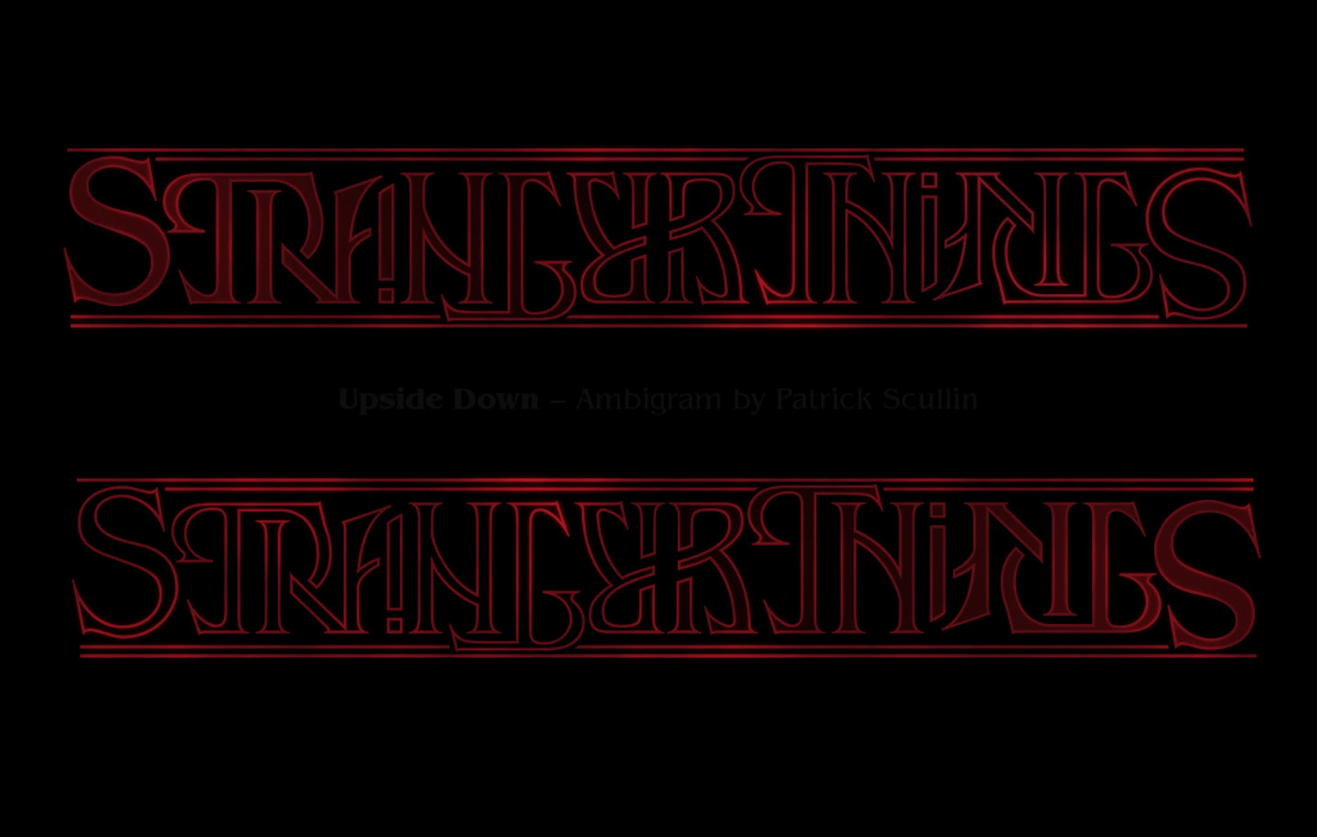
Well Universe, there you have it... an upside down tribute to Stranger Things in the form of an ambigram.